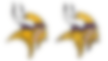
Look closely. The Minnesota Vikings have given their weatherworn Norseman a facelift.
The team's longtime logo has been enhanced "to give it a more natural and defined look," the Vikings announced Thursday on their official site.
The changes -- revealed first to season ticket holders -- stress a "sharper, bolder" look, but the tweaks are slight. Per the team:
» The shape of the horns have been altered and the shading updated.
» The base of the Norseman's horns now resembles those on Minnesota's helmets.
» The Norseman's mustache and face now feature thicker lines (and we suspect a slight nose job).
» Gold tones are now "brighter and less brassy."
» Finally, this seafaring gentleman's majestic braid has been shortened, triggering a "reduced logo height" (for those of you monitoring the pulse of league-wide logo height).
Vikings fans: Your beloved Norseman sports a subtle new look. Time to weigh in.
Follow Marc Sessler on Twitter @MarcSesslerNFL.

