NFL Photos | NFL Photography Gallery | NFL.com
The 122 of 2012: The Uniform Monitor's Ranking of American Pro Sports Uniforms
Dave Dameshek ranks the best American sports uniforms.
![[No Title]](https://res.cloudinary.com/nflleague/image/private/t_new_photo_album/t_lazy/f_auto/league/hzfhwerirxlk6f427ddj.jpg)

Patriots: When Robert Kraft and Bill Parcells changed the uniforms two decades ago, it made sense. They were washing off years of mostly mediocre-to-lousy play. Now, eight years since their last Super Bowl win (not to mention an image-tarnishing scandal), it's time for a full-time return to the glorious red-and-white Pat the Patriot getups. Not doing so is outrage to discerning eyeballs everywhere.
Padres: I'm curious to know just what in the hell the Padres think they're doing here. The greatest sartorial sin a team can commit is changing their already-dandy getups. Hard to imagine how the organization went from the distinctive to "Hey San Diego, dump the mundane blue getups and do as your Padres did put on the brown-and-gold!"

Rams: Here we go again: another team with spectacular uniforms buried in the closet in favor of ugly new ones. Let's name these ocular attacks here and now: Purposeful Uniform Contamination Event. Better yet, if we spell the third word with a "K," it makes P.U.K.E. If teams can unnecessarily change uniforms in the name of jersey sales and/or bad taste, we can alter the spelling of a word. The Rams deserve extra scorn for bypassing at least two superior options: the glorious blue and gold of the 1970s and the fearsome blue and white of the 1960s.
Chargers: Those awful navy pants. The unnecessary redundancy of blue. And the failure to not mess with the perfection that was the AFL-era powder-blue jerseys with the black-numbers-on-the-side-of-the-white-hats. The devil -- as they say -- is in the details ... so let's stick a pitchfork into whoever came up with this design. By the way, the late 1970s/early 1980s gold pants -- worn by Dan Fouts, Kellen Winslow and Louie Kelc

Thunder: Note to the (horribly named) Thunder organization: When you designed your uniforms, you were supposed to choose just a couple colors, not the entire rainbow. And please, "Thunder" isn't a team name -- it's a forecast. Go with the Twisters.
Bobcats: "Cats"? I thought you were the Bobcats? What about "Bob"? (Yes, Bill Murray fans, that was intentional.) Of all the uniforms to mimic, you choose the Thunder's?... I mean the Thunders'. Whatever the name is -- your unis are lame.

Astros: Okay, the half-a-rainbow jerseys from a generation ago weren't everyone's cup of tea, but they were certainly more memorable than these generic mix-and-match getups, which are almost indecipherable from those worn by Arizona's baseball team. Word on the street is the Astros will be returning full time to their 1960s throwbacks in 2013 ... but here in 2012 these uniforms get deservedly low marks.
Diamondbacks: I seem to recall an expansion team in the desert that wore purple and green. I'd almost swear they called themselves the "Diamondbacks," too. Couldn't be the same team, though -- you'd have to be seriously foolish to overhaul your entire color scheme after just one decade, especially when you won a World Series in those original getups.
Ducks: Black and orange is the best color combo available ... but that doesn't mean it can't be screwed up. Especially when you unnecessarily mix in some gold trim and the lamest logo design on the planet.
Bengals: Tiger print might work on Kim Kardashian's underpants, but not on a pro football helmet. Hey, Cincinnati, stop trying to be cute and just go back to the simpler, better hats with the block letter "BENGALS" on the sides.

Penguins: In 1980, the moribund Penguins completed the Steel City hat trick by switching to black-and-gold uniforms to match those worn by their more successful football and baseball brethren. Great idea, because it made Pittsburgh the only sports town around with all three major pro teams sharing the same color scheme. Why, then, would the Pens willfully choose to abandon the gold (or yellow, if you're Wiz Khalifa) in favor of a Notre Dame/New Orleans Saints metallic gold? That's not a rhetorical question. Seriously, why? When they won two Stanley Cups in the early 1990s, their uniforms were -- like the English translation of Mario Lemieux's name -- "the best." The new ones, on the other hand, are among the worst (or "le pire," if you're keeping score in French). The navy blue-and-powder alternates are nice, but not nearly enough to redeem the larger sin.

Capitals: Yes, these are upgrades from the teal-pocalyptic getups they wore for a dozen years (By the way, who decided a team named "Capitals" should wear anything other than red, white and blue? Did a descendant of Benedict Arnold work in the equipment room?), but the misguided attempt to modernize the original design is lowlighted by navy socks which blend too well with the pants, creating the sense Ovie and Co. are wearing Capri pants. (Hey, maybe they could change their name to the Capris!)
Texans: Look, this Capri thing is catching on! If you think the color of a team's socks is of minor importance, you are wrong. Simple fix, Texans: Go back to the red socks.
Avalanche: The depressing, overly complicated palette would at least get credit for originality ... except it's not original. The USFL's Michigan Panthers beat Colorado to the punch by two decades with their burgundy, blue, black and silver color scheme. The haphazard lines on the sweaters ain't helping matters.

Suns: Purple and orange should've been enough, but like Icarus, the Suns flew too close to the sun when they added gray to the mix. Dump these in the sea.
Kings: The Stanley Cup's arrival in Southern California might be a good thing for pro puck's profile south of the Mason-Dixon Line, but things would've looked even brighter in the Kings' more regal purple and gold of days gone by. And what's with that boney font used for the "LA" on the current sweater?
Ravens: The helmet is actually cool (and so is the excellent team name), but the rest of the uniforms feel somehow unfinished ... especially the black pants the team favors on the road. Put some stripes on them jazzercise tights, wouldya?
Rangers: It's hard to make a combo of two primary colors look bad ... but the Rangers pull it off with (one of) their current getups. You can't have red caps and socks with blue lettering across the chest. The blue-based unis greatest crime is being boring.
Wizards: So close, yet so far. Just like their puck-playing counterparts, the D.C. hoops team did the right thing by dumping the teal, but -- rather than just going back to the glorious Wes Unseld era unis they attempted to modernize the look ... and failed.

Angels: Changing the name from "California Angels" was a mistake. So was dumping the navy caps. Arte Moreno prefers the red-and-white design because it's the opposite of the "crosstown" Dodgers. Trying to force a rivalry with the Dodgers is understandable but unreasonable: The Giants were the Dodgers' rival before the Angels even existed. Besides, the getups once worn by Nolan Ryan, Bobby Grich and Reggie Jackson were cooler.
Falcons: Another puzzling, fussy design. I don't know if the old jerseys were getting those yellow deodorant stains, but putting big black blobs under the armpits seems like an overcorrection. These are better than the black helmets and jerseys worn by Primetime and Bobby Hebert, but the best move would be to just go to the black helmet/red jersey throwbacks full time. (Also an acceptable alternate: the all-red of Steve Bartkowski and William Andrews.)

Broncos: This year's full-time return to the orange jerseys almost gets Peyton Manning and his new pals out of a triple-digit ranking ... but no can do. The orange jerseys worn by John Elway in "The Drive" are a little overrated, but they'd be an upgrade over these. Sidenote: I'm one of four human beings in recorded history to favor the reviled brown and gold for the Broncos.

Hawks: Wait, where'd the navy come from? Weird move, Hawks. Weirder still, it makes the uniforms more forgettable than they already were.
Clippers: Ho-hum.

Rockies: Purple is tough color to pull off. It's even harder to make it look dull. Top marks for the Rockies on degree of difficulty.
Raptors: The Raptors, on the other hand, could actually stand putting a little purple back into their unis. (Note: I did not, I repeat -- did not -- encourage a return to the dinosaur jerseys.) The red and black is oddly configured on the current ensemble ... particularly the back of the shorts, which look like a half a toilet seat cover tucked into the waistline.

Coyotes: Yeah, the uniforms look good -- all monochromatic getups do -- but I shan't validate the shameless thievery. Phoenix looks handsome, but the front office has admitted to trying to recreate the look of the Red Wings. It's a generally good idea for an upstart organization to mimic the winged wheel, but copycatting only receives scorn here.
Lightning: Tampa Bay's are blatant rip offs of the far superior blue-and-white unis of the Maple Leafs (and even though I'm not expressly evaluating team names here, I'm nonetheless deducting points for the S-less, weather-forecast moniker).

Pacers: How much time could they have spent working on these? Four minutes? Five? These uniforms scream, "We're required to wear shorts and tank tops ... so we put some on!"
Brewers: The primary unis aren't horrible, but they're not good, either. They're just ... there. The wheat husk on the cap is a nice touch, but doesn't begin to compare with the baseball glove/"MB" logo. Overall, the royal blue and gold Gorman Thomas pinstripes are great ... seeing them once a fortnight is not.

Stars: The Stars get a tap of the stick on the ice for trying something different. Few NHL teams have ever displayed their name or player numbers on the front of the sweater -- the result makes about as much sense as hockey in the Sun Belt.
Panthers: The sweaters suffer from Line-a-palooza. Let's take an eraser to those things.
Hurricanes: The logo looks like a flushing toilet. (That's not a compliment.)
Predators: The best of a weak lot among NHL teams south of the Mason-Dixon Line ... that's what Northerners call damning with faint praise.

Cardinals: Shame on whoever's responsible for the vertical striping on the sides of football jerseys. Here, said stripes sully the otherwise sharp, deep-red jersey. Fortunately, the uncomplicated white hat was spared. And get rid of the black alternate jerseys. Cardinals are red. Period.
Flames: More proof you can't just throw some black into the mix and expect the uniform to get better.
Knickerbockers: If you haven't noticed, the Thunder have stolen your thunder with the black trim. If you can't win titles like "Clyde" Frazier and Willis Reed, at least you dress more like 'em.
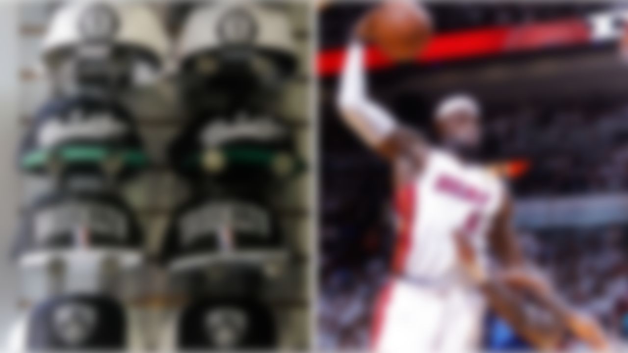
Nets: Messrs. Prokhorov and Z -- music's most unlikely duo since Paul McCartney and Michael Jackson -- have yet to unveil their basketball team's new look, but based on the logo and merchandise, we can assume it's gonna be ebony and ivory. Not as bold a move as it would've been before the Heat introduced their black-and-white alternates last year, but -- either way -- a return to the unbalanced red, white and blue getups worn by Micheal Ray Richardson would've been the better play.
Heat: Thanks to their decision in 2011 to dump the satin finish, the champs were already winners before last season even started. All in all, though, the sum doesn't equal the parts -- kinda like identifying 12 guys with a singular name like "Heat."

Timberwolves: To teal, or not to teal? That's a tough question anywhere, let alone in Minnesota. When the T-Wolves keep it as an accent, it almost works ... but I'm partial to the black unis with the tree-lined borders worn back in the days of Kevin Garnett.
Panthers: The Panthers' unis are bipolar: silver and black at home, powder blue and white on the road. Whichever one they're wearing, though, the result is the same: so-so.
Magic: Black-and-blue uniforms tend to bruise my eyeballs ... but the nifty pinstripes salvage these from being an out-and-out punch in the face. As for the team name, let's get rid of the grammatically confusing "Magic" in favor of "Tricks."

Vikings: The Vikings would be much higher on this list if not for the self-inflicted wounds caused by those horn-shaped stripes on the jerseys. The purple facemasks are a major downgrade from the white ones they used to wear.
Kings: The font on the jerseys ain't my cup of tea, but at least compared with the purple-based getups we've already ranked, these aren't too bad.
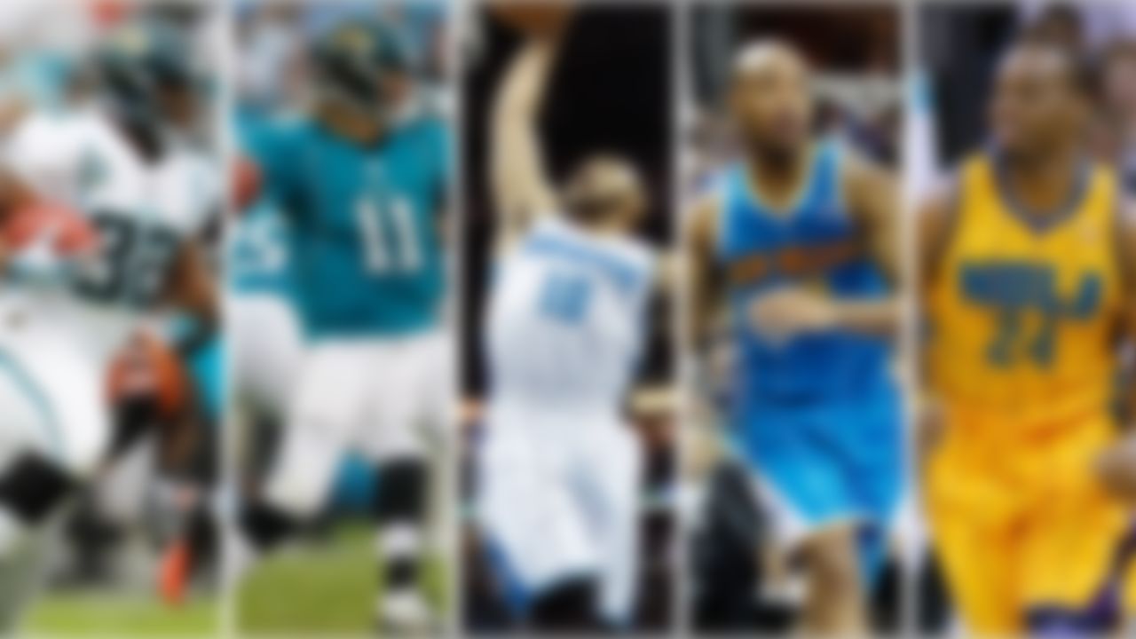
Hornets: These uniforms would be in the bottom 20 if the team was located in Vancouver or Detroit, but in NOLA, it makes sense to wear festive, garish getups.
Jaguars: Maybe it's because their hideous original unis set the bar so low -- or maybe it's the matte finish -- but the Jags are looking passable these days. Not good, exactly, but passable. Now, if only they could find a more passable passer than Blaine Gabbert.

Grizzlies: More and more teams are using two shades of blue in their uniforms. (I wonder why we rarely see that with another color -- the Milwaukee Bucks did it with two-tone green back in the 1980s, but that's about it.) Anyhoo, the two-blue look makes sense in Memphis, where they like their Blues pluralized.
Titans: The Titans will benefit as much as almost any NFL team from the matte finish Nike's employing all over the league in 2012. However, they really ought to avoid the navy pants/powder jersey combo -- it just looks weird with the white hats.
Rays: Here's an exception that proves the rule about changing one's color scheme. The two-blue Rays are a mild upgrade from their black-and-rainbow Devil Ray forefathers.
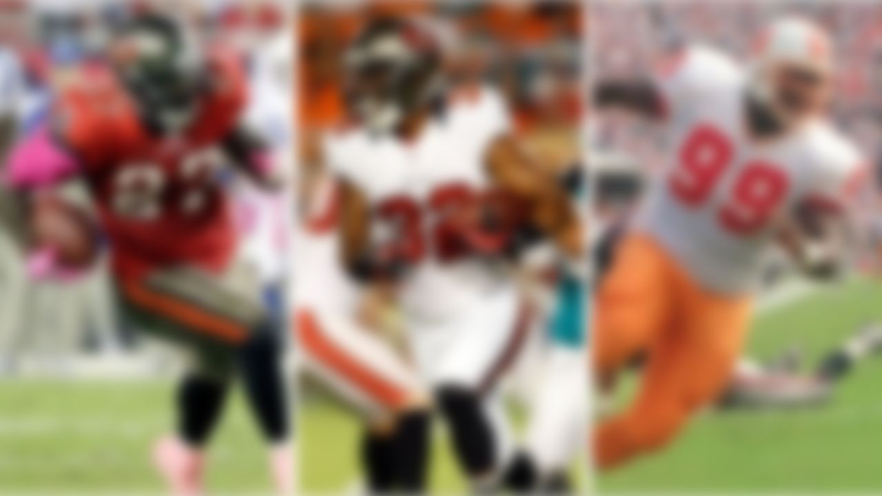
Buccaneers: The Bucs' uniforms serve as Exhibit A for why this list needs to be refreshed annually. The world rejoiced 15 years ago when Tampa dumped the orange-and-white getups (and with good reason: Buccaneer Bruce, the winking fella in the plumed chapeau tilted fashionably askew, always felt a little too ... fancy), but these days more and more people are pining for a return to the creamsicle look. The pewter and red remains the better choice as far as I'm concerned, but the team's overreliance on their white pants downgrades the ensemble.

Devils: The creator of checkers should have trademarked his game's color scheme, because black and redundancy abounds in the sports world these days. It's a good move, because the combo works. That said, the Devils should have stuck with their original pine green.
Trail Blazers: The primarily black unis are better than the primarily red version. The Blazers disagree ... but since I'm making the list, they find themselves in the bottom half.
Senators: The Sens would also do themselves a favor by switching to the black alternates full time.
Bulls: The blood on the bull's horns in the logo looks like something an eight-year-old would do with his Crayolas. The only other noteworthy thing about these uniforms is they were worn by the game's best player ever (and also by a guy who wore No. 45).

San Antonio Spurs: As you'll see (much) later on this list, silver and black is a combo held in very high regard for a certain other team ... but just like the guys who wear them -- or perhaps because of the guys who wear them -- these getups are a snooze.
White Sox: Chicago's South Side ball club will forever be hamstrung by their own (cool) name: White Sox. Unlike their red-based counterparts in Boston, these socks, by definition, have to be white -- as in vanilla. The team's "Good Guys Wear Black" marketing campaign was great, but that was two decades ago ... and it seems philosophically wrong for Bill Veeck's boys to be wearing something so plain.

Blue Jackets: The stripe reaching from one wrist across the shoulders and back down to the other wrist makes the Blue Jackets look more like the old Winnipeg Jets than current Winnipeg Jets do.
Mavericks: Two tones of blue with green accents make for an unorthodox-but-potentially nice mix ... but the design here looks less "NBA player' than "country club tennis pro."
Jets: Outside of the jet on the sweater, these getups have little to do with the organization's first go-round in Manitoba. However, these aesthetically pleasing numbers are a solid example of what two-tone blue can do.

Nuggets: The shift to powder blue-and-gold might not be the world's most rugged look, but in a region that enjoys more blue skies than anywhere else in the country, they make sense. Only the navy alternates keep them on the wrong half of the list.
Royals: We begin the better half of this list with the Royals, whose welcome return to powder blue would be embraced even further if it extended below the belt. Get your mind out of the gutter: I'm talking about their pants.

Sharks: The Marlins commonly get the credit (or blame) for starting the teal craze, but it was in fact the Sharks who broke it out two years before Major League Baseball existed in South Beach. The subtle addition of orange a few years ago has only enhanced an already nice uniform.
Mariners: Color Scheme Overhaul (CSO) is generally frowned upon here, but the M's subtle teal accents are a savvy use of an often-reviled color.... and somehow befitting of a team in the Pacific Northwest.
Dolphins: Long before anyone outside a paint store knew what "teal" was, the aqua Dolphin set the pace for distinctive, regionally appropriate uniform design. They've helped define the region -- and the region reciprocates. They'd look awful in Chicago, but the aqua and orange is more Miami than Crockett and Tubbs.

Cowboys: This is heresy to a lot of people, but the Cowboys have the most overrated uniforms in sports. The blue is too bright, the pants are too shiny, and -- on the rare occasion they don't wear their white jerseys -- they opt for navy instead of the royal blue gems from Super Bowl V.
Lions: The Lions beat the Cowboys by a whisker thanks to their (strangely named) Honolulu blue jerseys. One tweak: extract the black accents.

Bruins: Some of sports' more iconic teams have maintained the general integrity of their uniforms, but their misguided attempts to upgrade have instead sullied the overall look. Take the Bruins: The Bobby Orr era getups with the gold shoulders are nicer than the current ones.
Cardinals: A lot of people adore what the Redbirds have going on. Nothing wrong with 'em, I guess. But wearing a uniform without stripes is ironic for a team that's had some of the more elaborately festooned getups in baseball history. You might recall the powder blue ensemble and red-and-white-striped stirrups on Ozzie Smith and Co.
Lakers:The Lakers should wear gold on their home floor. Period. Next, their base road ensemble is the best primarily purple uniform in sport, but the removing the raised numbers and logo with a black shadow behind them was a bigger mistake than starting Smush Parker at the point.

Jazz: Tremendous move to return to the franchise roots with the old logo over the hokey attempts to stamp the misnamed "Jazz" as Utah's team. However, the new unis would look even better if they'd gone with either purple (like they wore early in John Stockton and Karl Malone's careers) or green (like they've got in the alternates) as the primary color.
Blue Jays: Going back to these is another strong move by a franchise that needed to take a long look in the mirror and admit they'd made a horrible mistake by getting away from their roots. I particularly love the red Canadian leaf in the logo. The return to this look makes both uniform aficionados and Jays fans happier than Bob and Doug McKenzie in the Elsinore Brewery.

Phillies: I understand the history behind these, and I kind of like the blue star set inside the "P" ... but the overall look is too close to that of an ice cream man. Sorry, Philly fans, I'll see if I can make it up to you later.
Eagles: The current green-with-black-trim uniforms are good. Their gray-panted Super bowl XV uniforms were better. The getups from the team's 1960 championship season, which they broke out again 50 years later to start the 2010 season, are the best.

Rockets: To be fair, anything would be an upgrade from the navy-and-wide-pinstripes Charles Barkley put on when he joined the Dream's back-to-back championship team (substantiating the rule you don't change uniforms in the midst of a potential dynasty). The current unis don't provide many good memories besides the early days of Yao's once-promising career, but they're more stylish than the creatively bankrupt ones they wore during the title years.
Reds: Nice enough ... but why the raised numbers and logo, Cincinnati? You're not the L.A. Lakers or N.Y. Rangers. Get rid of the black accents and just be you. You're the Reds.
Nationals: Now that they've dumped the silver-shadowed font from the uniform, the Nats are looking good. Problem is their color scheme isn't exactly unique. Speaking of which ...
![Red Sox: There's nothing wrong with navy and red as a color combo -- but Major League Baseball is officially oversaturated with it. The Red Sox look good ... but they also look a lot like the Twins, Braves and Tribe. They're rated the lowest of this quartet because of the loud-red alternate jersey.
Twins: Speaking of alternate jerseys, the Twins ought to lose their navy option. Overall, not that bad ... overall, not that great.
Braves: The off-white home uniforms is a nice touch, but otherwise there's not a lot to differentiate them from the navy-and-red pack.
Indians: [See above reviews.]](https://res.cloudinary.com/nflleague/image/private/t_new_photo_album/t_lazy/f_auto/league/dqgcrus1cmb4os2gf37b.jpg)
Red Sox: There's nothing wrong with navy and red as a color combo -- but Major League Baseball is officially oversaturated with it. The Red Sox look good ... but they also look a lot like the Twins, Braves and Tribe. They're rated the lowest of this quartet because of the loud-red alternate jersey.
Twins: Speaking of alternate jerseys, the Twins ought to lose their navy option. Overall, not that bad ... overall, not that great.
Braves: The off-white home uniforms is a nice touch, but otherwise there's not a lot to differentiate them from the navy-and-red pack.
Indians: [See above reviews.]

Blues: From an aesthetic point of view, the Blues don't need two shades of their eponymous color, but the flying music note saves the day.
Sabres: Let's just pretend the red-and-black getups they wore from 1996-to-2006 never happened. Long live these beauties.
Warriors: The royal blue and gold of the Run TMC days were great, too, but competing with the Golden Gate logo is a bridge too far.
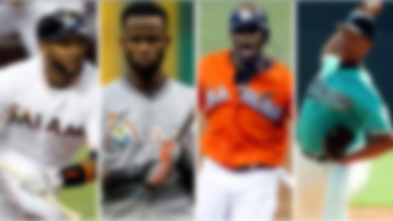
Marlins: Like Jerry Orbach told Patrick Swayze at the end of "Dirty Dancing": "When I'm wrong, I say I'm wrong" ... and I was wrong for disparaging the Marlins' updated look when it debuted. I now realize these uniforms work because of the region in which they play. The art deco font and Sunshine State-appropriate color scheme gets a thumbs up ... especially because the team's original teal is ever so slightly still in the mix.

Bucks: In my book, red-and-green isn't just synonymous with Christmas, it also indicates a sports franchise with a bold sense of style. The Bucks' getups make me want to sit on a barstool on cold winter night and watch the local team.
Wild: What I said about the Bucks goes double for the Wild. The classic lines and general design of both the red and green sweaters give the impression the franchise has been around for a 100 years. But the name? "Wild"? As in "The Outdoors"? Yuck. Don't bring it inside -- it'll stink up the joint.

Saints: The fleur-de-lis set on metallic gold makes for one of the more spectacular NFL helmets. The problem is the gold in the hat doesn't match the gold in the pants ... which doesn't match the gold in the numbers ... which doesn't match the gold around the collar ...
Pirates: The Buccos sport the city's true version of black and gold with these timeless classics. They're simple, yes, but that's a good thing. Then again, the pillbox caps and the almost-infinite number of color combos Pops Stargell and Co. had at their disposal back in the 1970s and early 1980s were plenty cool, too.

Pistons: It'd be downright unpatriotic to disparage a team that chooses red, white and blue. (Well, almost. Sorry, Clippers -- your unis are still boring.) Motor City's baddest team took an ill-conceived road trip to Teal Town of the 1990s, but that's in the rearview mirror.
Rangers: The Blueshirts haven't done a whole lot of screwing around with their base uniforms over the last half century. Nor should they have.
Cubs: Just as the carpet should match the drapes, the jersey font really ought to match the one used on the cap. You know, like it did before the Cubbies became an abject punchline.
76ers: The red-and-black unis worn during the Allen Iverson years were questionable, but the Sixers have since answered critics with this more timeless look.
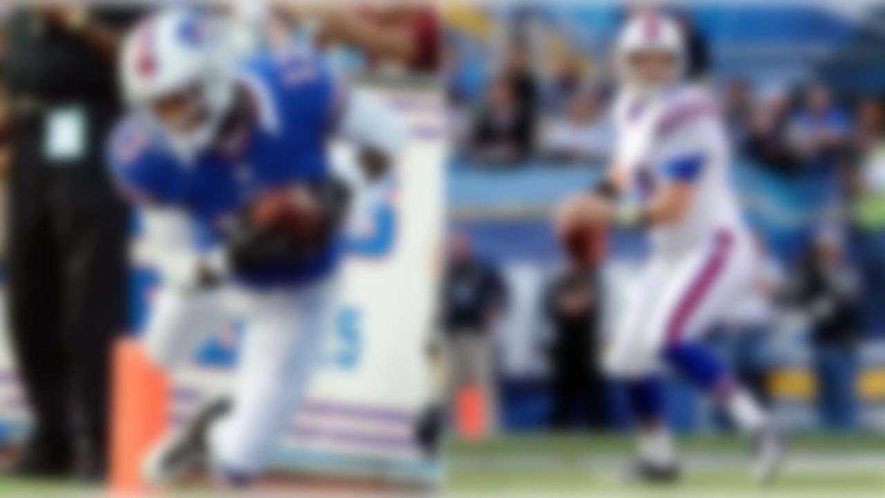
Bills: These upgrades were the feel-good uniform story of 2011 ... but regress ever so slightly because of the neck roll effect in 2012.

Canucks: Pay attention, Mavs: this is Kelly green and royal blue done right ... at least when they wear their classic "stick-in-rink" logo (which, if you look closely, is actually a "C"). They do need to dump the Orca logo, but after so many years of infamously awful uniforms, Vancouver is looking good again.
Browns: With the exception of those three years on hiatus in the 1990s, these Rust Belt beauties have been around since the dawn of time ... or something like that. They've dabbled with satiny brown pants (yuck) and worn numbers on the sides of their hats (yay), but the blue-collar charm of the base uniform has stood the test of time. It does bother me a team called the Browns has more orange in their unis than the Syracuse Orange (yes, I know they're named after Paul Brown), but I'm hoping their future owner Jimmy Haslam doesn't follow through on making any significant alterations.

Seahawks: I don't mind saying I had my doubts about Nike's redesign ... but these are a revelation. The unorthodox use of neon green might connote arena football to some, but it looks great with the matte-finish navy of the new uniforms. Minor note: Change the gray numbers to white. Overall, a vast improvement from the Finn McMissile-colored satiny mess that'll forever stain NFL Films highlights of Super Bowl XL and Emmitt Smith's record-breaking run, and not that far off of the still-tops silver-and-blue ensemble of the Jim Zorn years.

Chiefs: An underrated classic now made even better by the return to a matte finish. The arrowhead hats, the red pants, and overall straightforward design are gangbusters ... and, in the rarest of feats, virtually unchanged since their AFL days.
Packers: Just like their Super Bowl I foes, the Packers look even better in 2012 thanks to the lack of a satiny finish. From the time they stuck the GB logo on the hat in the early 1960s (and briefly putting it on the sides of the pants in the 1980s), these getups have stayed the same from Starr to Favre to Rodgers.
Canadiens: Consistent excellence is the most coveted trait in sports. So why don't the athletic also-rans take a page from teams like the Habs, whose bleu, blanc et rouge has stuck around longer than any number of NHL franchises? Matter of fa

Athletics: Examples of dark green and gold are tough to find around the sports world, but it's not just the color scheme that sets these apart. Charles O. Finley might not have been the most generous owner, but he did come up with the unique gold socks under green stirrups and white shoes ... and the new/old gold jerseys move 'em up even higher. To paraphrase their former batboy, you can't touch these.

Orioles: I'm not as crazy about the return to the white front on the cap as everybody else, but these are glorious getups.
Giants: On the strength of the off-white home unis, the Giants edge their black-and-orange brethren in Charm City.

Oilers: The return to a royal blue-and-orange combo is one of 2012's best moves in athletic aesthetics. Why the Oilers would ever abandon this look in the first place is beyond me ... but let's not get too bogged down with the mistakes of the past.
Islanders: The Isles are back to the getups in which they won four Cups after an embarrassing dalliance with the Gorton's Fisherman. (Oops, I think I was just getting bogged down in past mistakes.) History aside, these are snappy.
Metropolitans: 15 years after making the mistake of adding black to their uniforms (mistake bog), the Mets have returned to royal blue and orange ... and on behalf of Tom Seaver, Ron Svoboda and Gil Hodges, I'd like to thank them for that.
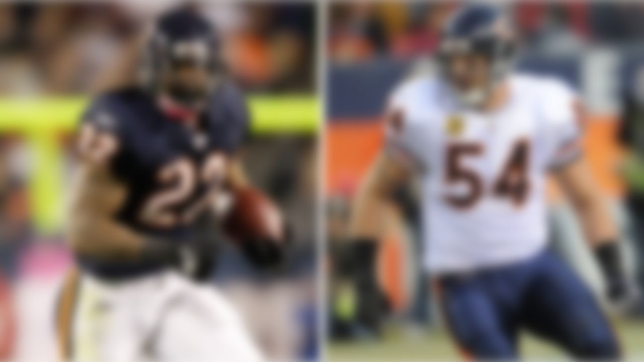
Bears: Points deducted for the navy pants. In the name of Sweetness, I insist the Bears go back to the all-white on the road, otherwise, not a lot to quibble about with these classic beauties.
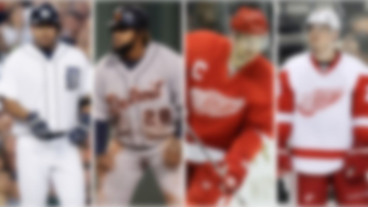
Tigers: There might be other baseball logos as good as the Olde English "D," but there aren't any better. The home whites are brilliant, and the road grays are kept from drabness by the shock of -- there's that color again -- orange.
Red Wings: Lean and unspoiled by any extraneous nonsense like, for instance, a second color ... plus, the winged wheel.
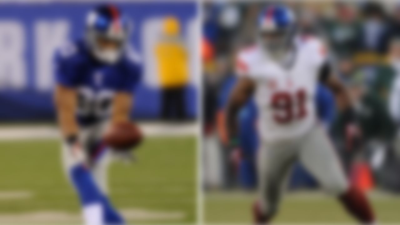
Giants: Like the team that wears 'em, these getups deserve more credit. Love that lower case 'ny' and the jersey, unsullied by a single stripe. Further kudos for leading the way by going to the matte finish before almost any other NFL team. Let's hope the Mara family has the good sense to resist the calls to return to the 1980s look from Jints fans nostalgic for LT's glory days.
Colts: These blue and whites are clean, simple and nifty. And they're even better since they went with the gray facemasks a few seasons back.
Maple Leafs: Thanks to facile blue-and-white color scheme, the striping on the sweaters is ornate without being silly. Are you shocked these beauties didn't crack the top 10? Me, too. From this point on, we're officially splitting hairs.
Cavaliers: The bold stroke of a uniform without any white earns the Cavs a silver medal in the "Best NBA Uniform" competition. Take that, LeBron!
Redskins: Thank heavens! The gold pants are back! Only problem is, they still like rotating in the white and burgundy pants. Let's make a deal, 'Skins: Stick to the gold all this season, and I guarantee you an even higher spot on the list next year.

Celtics: Gave some serious thought to putting the Cavs ahead of the Celts -- especially considering the black-accented green unis Boston breaks out way too often -- but Boston's classic base getups are still the best in the NBA.
Jets: Terrific move back in 1998 returning to a darker version of the uniforms worn by Broadway Joe and Co. Now, if only they'd break out the green helmets of the 1980s once in a blue moon, we'd be in business.
Steelers: With the logo on just one side, the helmets are nothing less than the greatest in football. I still say they'd be better with a gray facemask (as in: The color of steel), but decades after so many other teams have attempted to incorporate black into their uniforms in the name of intimidation and/or jersey sales, the Steelers and Raiders still wear it best. The jail stripe throwbacks they'll try this season aren't pretty ... but at least they're better than the gold helmet look they've donned the last three years.

Yankees: Love the iconic pinstripes, but the road gray might be even better. The navy block-lettered "New York" across the chest lets the home crowd know they're about to get a beating from sports' biggest bully.
Blackhawks: Politically incorrect (and vaguely feminine) the logo might be, these are plum glorious, virtually unchanged, and the best in hockey.
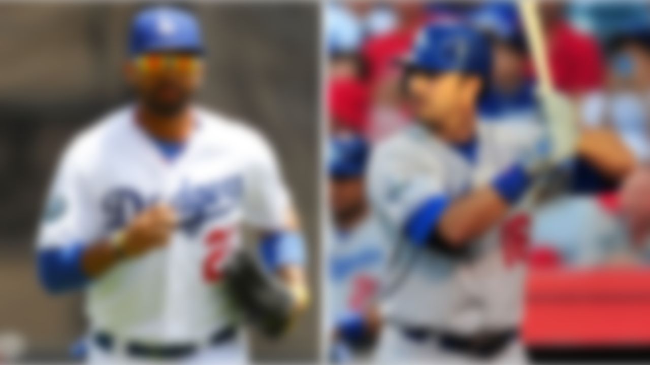
Dodgers: Most hardball fashionistas will balk at any team being ranked ahead of the Yankees, but gimme the crisp whites and Dodger blue any day. The key? The red number. Take it away and you've got the Royals' clone. With it, you've got baseball's best getups ... and one of the very best in sports.

Raiders: As long as uniform rankings exist, the Raiders will be at -- or at least very close to -- the top. Take note, all you teams with the vertical jersey striping and similar such nonsense: when it comes to uniforms, the Raiders just win, baby. (Well, almost.)
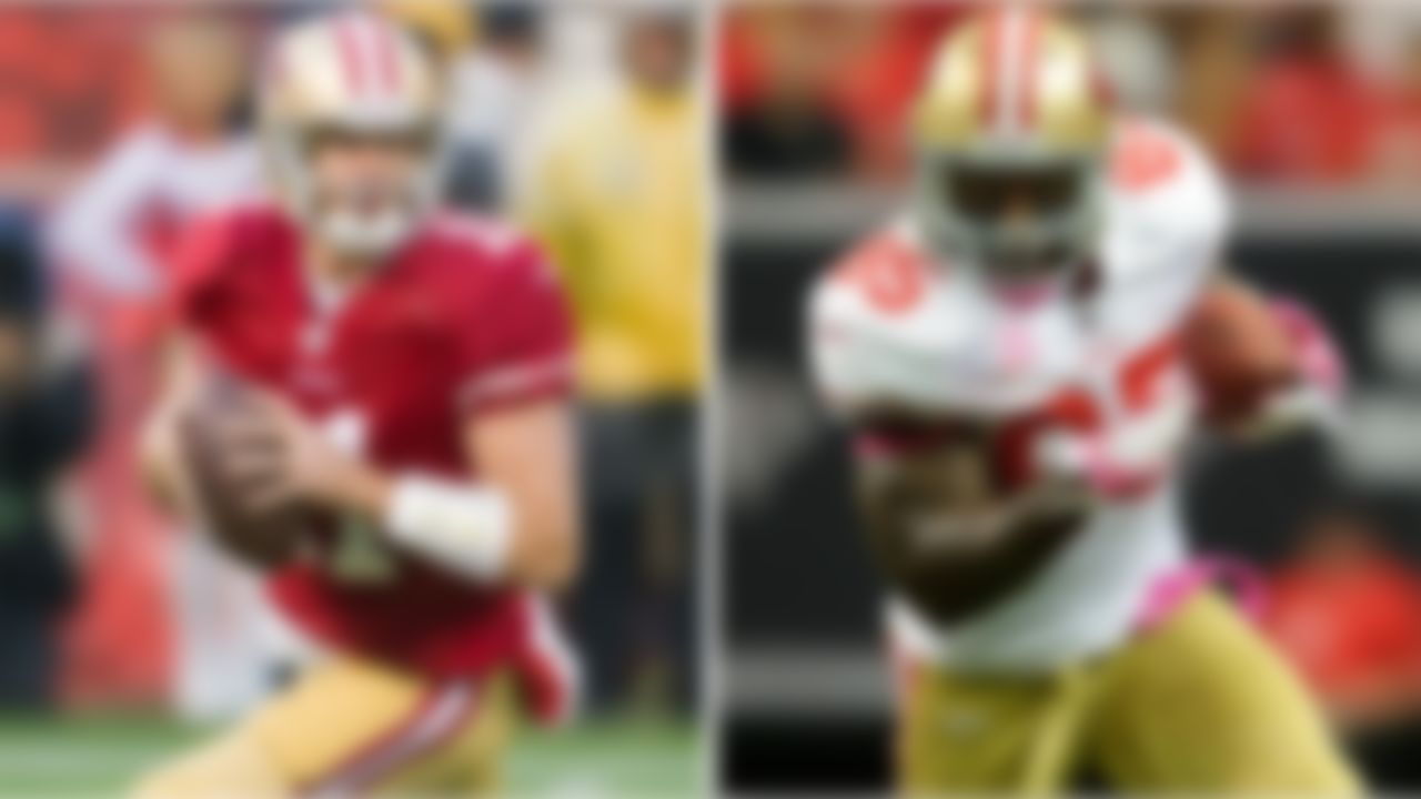
49ers: The Bay Area sweeps the top two spots in the NFL rankings thanks to the retro-chic outfit that actually improves upon the Montana era with thinner striping on the pants. Match the Niners up against their East Bay rivals, and you've got the best uniform matchup in sports

Flyers: In the name of full disclosure, I am not a Flyers fan -- matter of fact, they're my least favorite team in sports -- but dang if those orange and black getups don't sing like Kate Smith in the Spectrum before a playoff game. They're paradoxically straight out of the 1970s and timeless all at once. Kudos, you dirty creeps. May this be the only thing you win for another century.
![[No Title]](https://res.cloudinary.com/nflleague/image/private/t_new_photo_album/t_lazy/f_auto/league/xwrwklncj1kamajpg9lc.jpg)
